UX DESIGN · WEB · SIDE PROJECT · 2025
Built for My Own Skin
A personal project turned full blog, designed and built to track skincare habits and indulge the part of my brain that just wants to organize and create. Designed for the gap between spreadsheet and hobby habit.
THE CHALLENGE
The Challenge
No tool did what I actually needed.
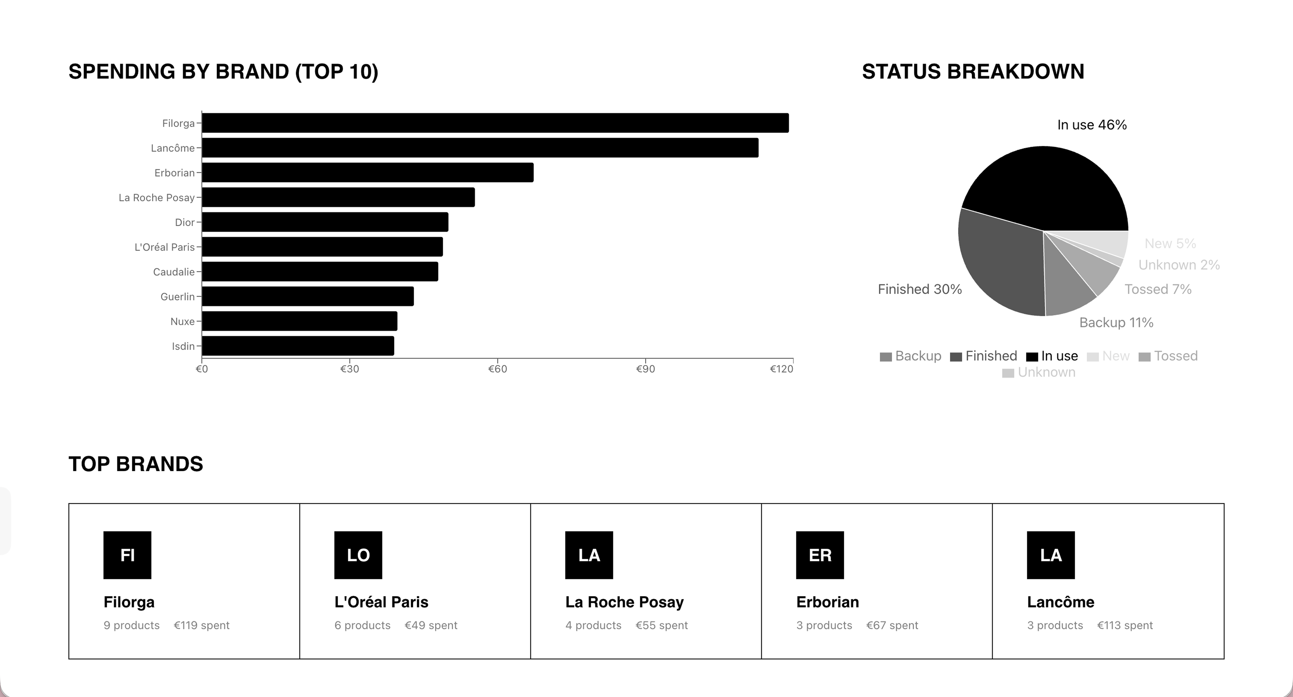
The spreadsheet was functional but not the right shape for how I used it. No mobile experience, no visual layer, no way to see patterns across purchases over time. I wanted to know what I'd spent, what I'd loved, what I'd repurchased, and what I'd never touch again. The right answer was to build it.
THE SIDE PROJECT ADVANTAGE
When you're the user, you skip the research and go straight to the insight.
Every product decision came from using the thing. I didn't run interviews to find out data entry was painful — I felt it while entering data. That tight feedback loop is what let me iterate quickly and stay honest about what actually mattered.
THE APPROACH
The Approach
Stream of conscious design.
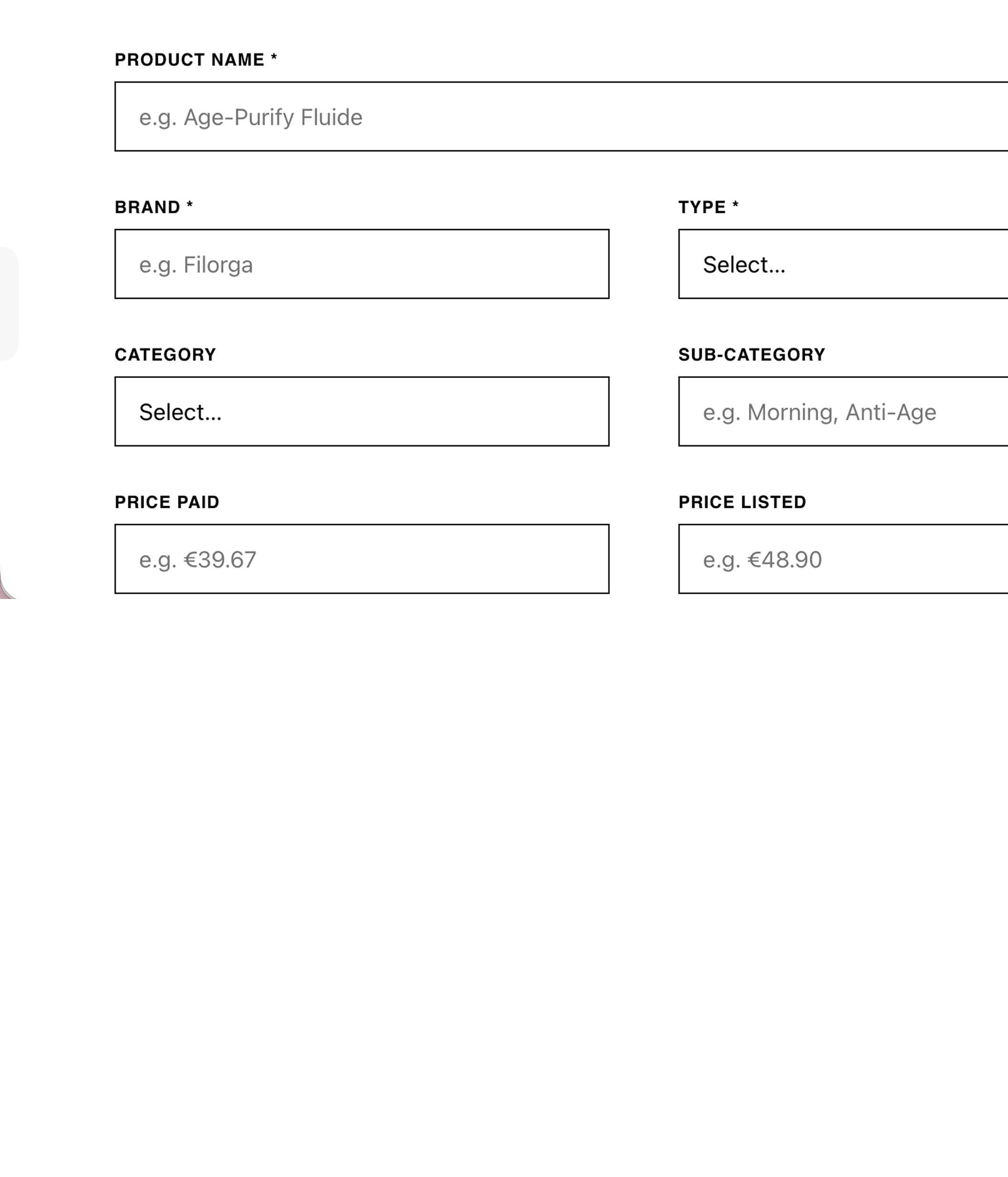
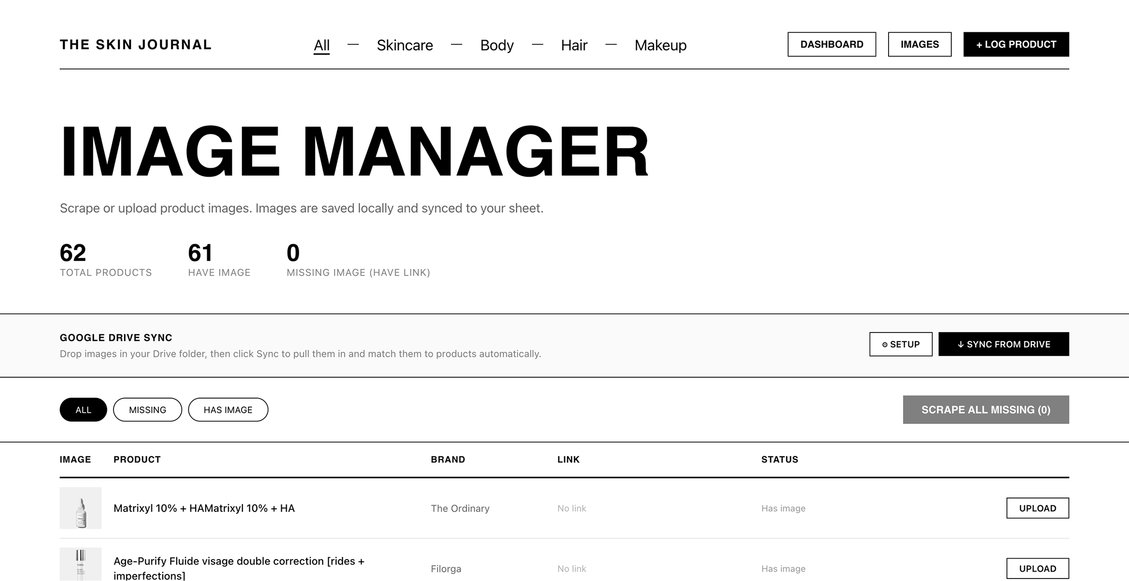
I knew what I needed: all my spreadsheet data with reviews, ratings, and start/finish dates; login so my spend stayed private; image management with background removal built in; and filters to my heart's content. I didn't look at a single benchmark — I just dove in. With no team to negotiate with and no stakeholders to align, every decision moved fast. I directed AI as a dev contractor: described the feature, reviewed the output, gave precise feedback. The constraint was knowing exactly what I wanted well enough to articulate it. Turns out that's the same constraint as any good brief.
The Process
Define
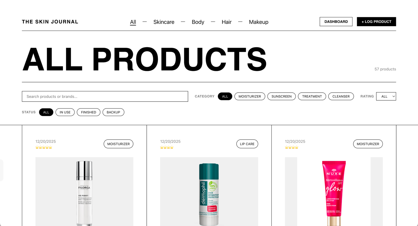
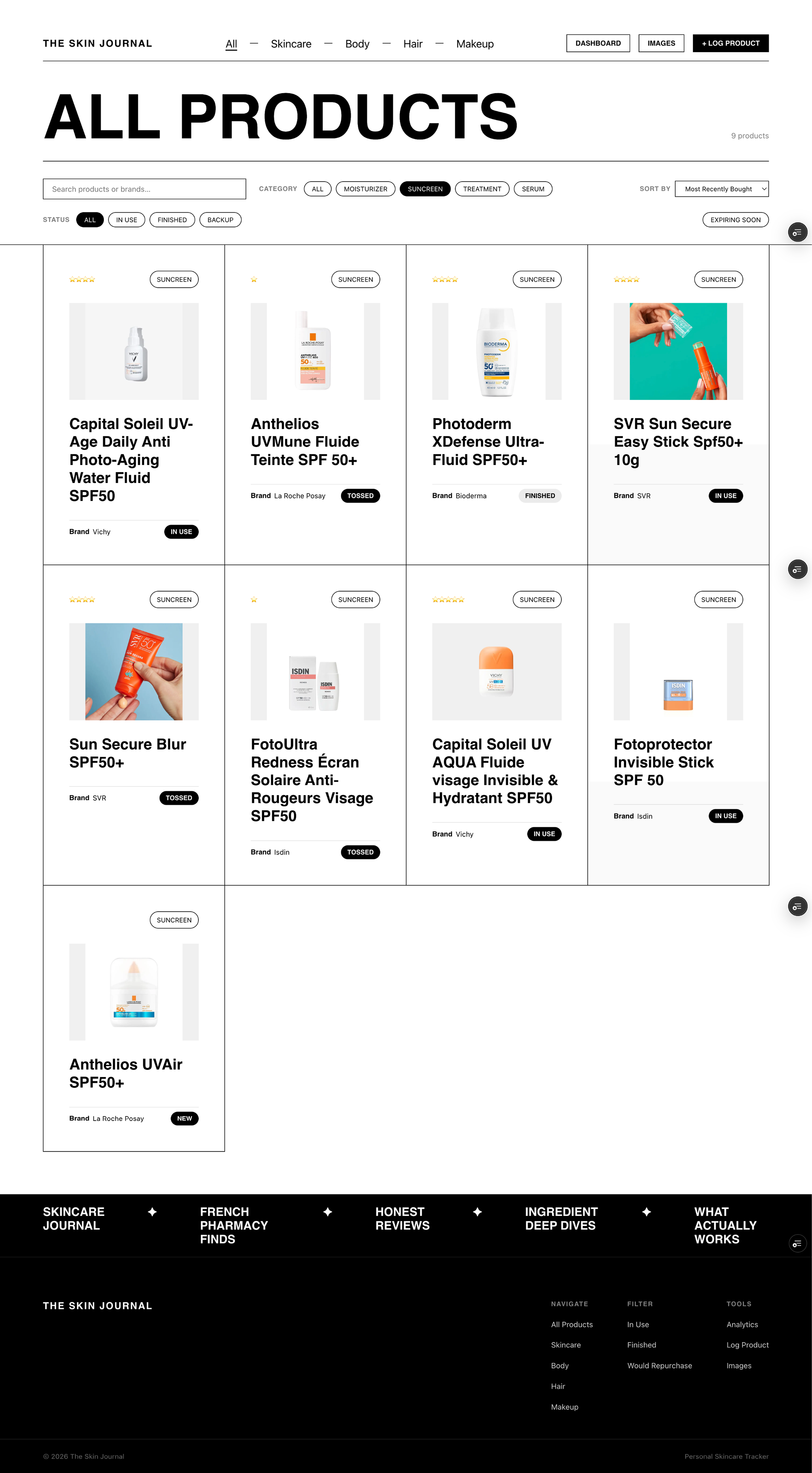
Started with the spreadsheet I'd been using for months. Mapped what worked (the data model), what didn't (everything about actually using it). Defined the core features: purchase log, ratings, finance dashboard, and an account system to keep data persistent across sessions.
Design
Designed mobile-first, because that was the gap. Focused on making data entry fast and low-friction — the moment that had broken every spreadsheet attempt before. Finance tracking required translating formula logic into a UI that surfaced patterns, not just numbers. Recharts handled the visualizations.
Build
Directed AI as a dev contractor throughout. Described features, reviewed output, gave precise feedback. The two highest-complexity features were photo upload and account management. Account management shipped first — it's the feature I'm most proud of. Product photos get their backgrounds automatically stripped on upload.
Iterate
Still in active use, still in active development. Photo upload from mobile is next. Future ideas include a map, social sharing, and a "what I used today" view — none committed, all earned by actually using it.
The Outcome
The honest outcome is that I use it. For a side project, that's the metric that matters. The account management system, the finance dashboard, and the purchase log all work. Photo upload is next. What this project proves isn't scale — it's speed and self-direction: the ability to go from "I need this" to "this exists" without waiting for anyone else.