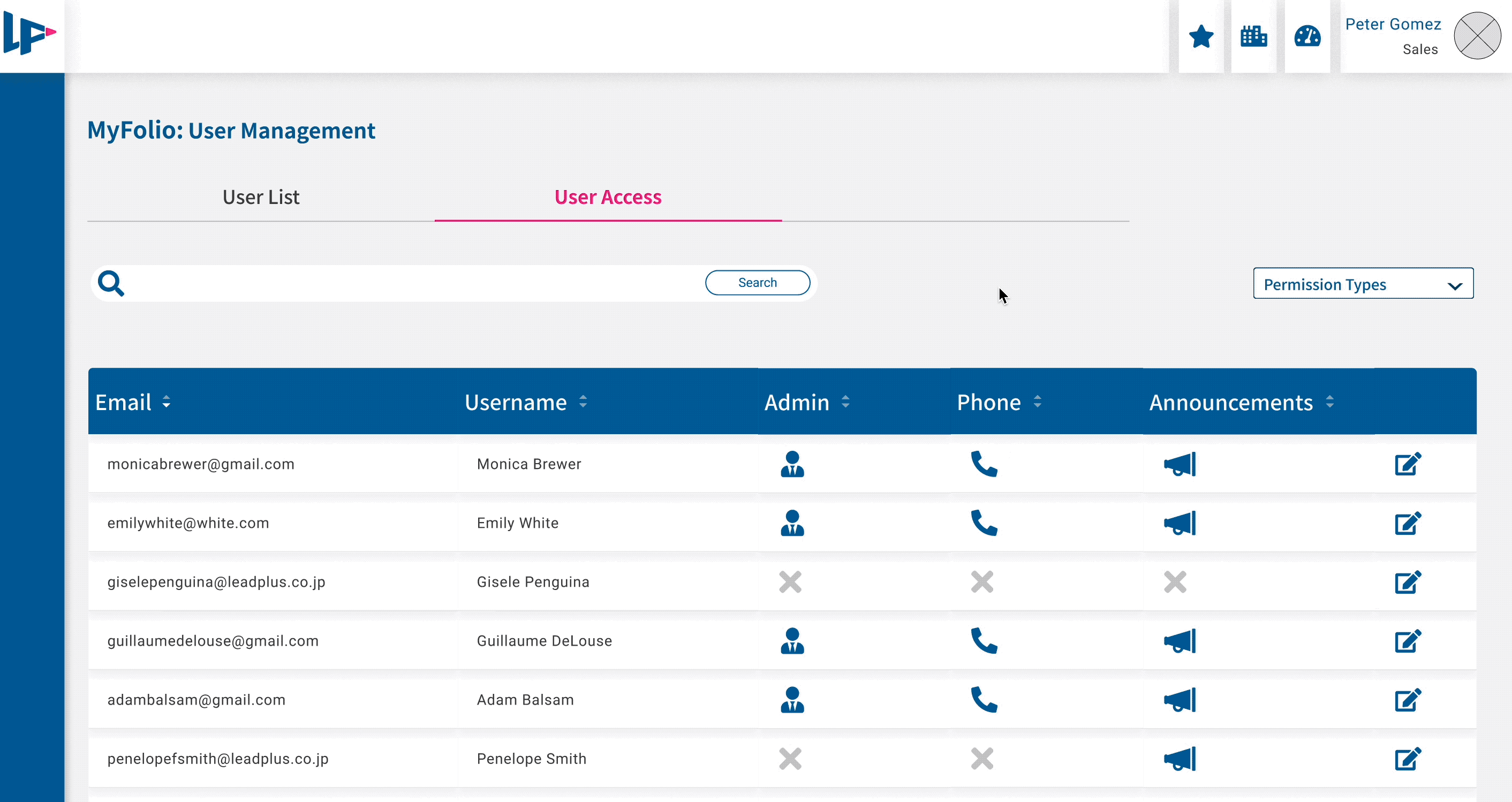
Announcement board
This is an in-production announcement board for a B2B client-facing platform that allows the sales team and customers to receive and view their accounts' announcements. Internal team members can create, edit, save and send announcements to user groups.
Situation
Company
LeadPlus
Year launched
2021
My role
Product designer, researcher
Brief
Internal and external users do not receive news about the platform or their accounts in a central place so notifications are dispersed around mass and private emails, making information hard to find. As there are many types of users on the platform, many kinds of information are being sent out. Typically emails were sent to external users and internal communication was done via Slack. Emails were not consistently tagged for easily findable information and it was increasingly difficult for people to create up-to-date email groups for the correct recipients.
Challenge & goals
Create a centralized and customizable notification center for all users
There are many kinds of internal and external user groups involved:
-
Internal groups include various sales teams, the service team, managers and stakeholders
-
External groups are broken down into ad agencies, businesses, and individuals
As the platform grows with its users, information is getting hard to keep track of in one place. Some requirements of the project included: -
-
Technically it must be built to use with Jira and copy and paste Confluence articles
-
Must be able to send to specific, editable groups
-
Must allow notifications to be tagged and edited
Design process
How I manage my responsibilities in a project
My involvement began with a project kickoff led by the PM and also included the lead developer and stakeholders. Together we made sure we clearly understand the requirements, potential pain points and business goals. Along with this communication, I began to research which included user interviews and a competitive audit. From there I could work on user stories and storyboards. I use the data I have in Google Analytics and June to tell me what user groups are using for devices when they are checking the platforms, and what times of the day. After looking at the data, I can start wireframing and creating dome ideas to share with the team. Mockups are tested at various stages to be analyzed and iterated upon. This line can often take the form of a circle and be repeated many times throughout the course of a project.
Brainstorm
Research
User stories
Wireframes
Testing
Analysis
Research, tools, & methods
The desk research and communication that happens before opening Figma
Before Figma, before sketching, there is a lot of desk research. Unlike other projects in the company, this is a very common feature that is easy to research: an announcement board. I start looking at Google Analytics and June for data about who is using the products on what devices at what time of day and any other relevant statistics I can gather. Several software products I use in my personal and work life have similar features so I conduct a competitive audit. I go back and ask the developer for this project some questions about technical limitations and possibilities. Along with my product manager to help with Japanese translations, we conduct some user interviews and keep our notes in Excel before making our final summaries in an Atlassian Confluence document we can share with the team.
My first iterations are done on paper and mockups move to Figma for low and high-fidelity designs. I put my Figma prototypes into Maze to test and gather feedback from teammates and stakeholders.

User Interviews: What do users want and need
Breaking down needs from various user groups
As mentioned earlier, there are internal users (sales teams, service team, PM, stakeholders and super users) and external users (ad agencies, businesses, and individual clients). With the help of my PM, we gather 3 members of each sales and service team, stakeholders and 2 super users. We ask them about their current methods of receiving and distributing information regarding the platform and its relevance to their roles. The service and sales teams walk us through their processes and pain points.
After several rounds of discussions and interviews, we arrive at similar findings.
-
senders want to send notifications to groups of people (sales info, platform updates, changes among modification procedures to staff, etc)
-
senders and receivers want to filter messages based on tagged content
-
senders want to be able to edit content of messages to easily re-send or update as needed
-
it must be connected through Confluence for security and technical reasons With these insights in mind, I can begin on the user workflows.

Super users need to create, edit, tag, and send content to different groups to have flexible, efficient communication.
User flows: A clear path for users to easily reach their goals
Identifying different users' journeys for different user types
After reviewing the business requirements, the interviews and the insights, I write the backbone of the announcement board feature: the user stories. This step for me always starts on paper and includes user flows so I can start imagining the flow for our various internal and external users.
-
As a client or ad agency, I want to see all the notifications about my accounts and MyFolio so that I don’t have any surprises & I can be informed.
-
As a sales team member, I want to see all the notifications about MyFolio and publisher news (Yahoo, Google, Facebook) so that I can make the best decisions for my client’s accounts.
-
As a platform admin or service team member, I want to write & update announcements, & manage who else gets to make announcements, in Confluence so that I can share them easily with different user groups to be catalogued.
Desk research: Competitive audit
Researching common themes, best practices and measuring the benefits of real-time, in-app alerts

I create a mood board based on popular content-sending systems and tools. Now that I know all the user needs and business requirements, I can start putting the pieces together. One of the more extensive discussions we had had as a team was the question of real-time, in-app alerts to be received by the user. It was a feature some team members felt would be very useful. Our usage data at the time suggested that external users were checking the platform around once a day, looking at the overview of info for up to 10 minutes and signing out.
The dev informed me that while possible, creating real-time alerts would require a lot more time and resources than if the user were to receive the notification alert upon login. As users were not spending long periods of time on the platform, coupled with the knowledge that extremely time-sensitive information was very rarely sent out, we decided only to have notification alerts upon user login.
Wireframing & mockups
From paper sketches to Figma prototypes, communication is critical
With the requirements, interview data, and user stories I sketch out some lo-fi wireframes. The first person I typically talk to at this stage is the developer. Not only does he usually have good ideas, but he can also let me know if any ideas or concepts I'm thinking of are deceptively complicated. This is an easy way to quickly eliminate some frames as well as keep people involved in the design process. Based on his input, I move up with some higher fidelity versions in Figma that I can show the rest of the team.
I make some simplistic and interactive wireframes to present to them and they eliminate the ones that don't fit our needs. All the concepts with preview text were discarded as stakeholders were concerned users would not be as likely to open notifications if they could skim the content in preview text. Another idea that we didn't continue with was a feature for senders or super users to filter notifications by recipient group. While this could be a useful feature for senders as it would allow them to see which sales groups received which emails quickly, it was deemed unnecessary for version 1 and we would look into it again for a later version.


Testing & validations
Testing in Maze and measuring KPIs

I put a high-fidelity wireframe and mockup into Maze, my favourite testing program. Here I can get feedback from teammates and stakeholders and tweak any remaining issues before proceeding with the final prototype for development.
The testers gave positive feedback and the proposed mockup had a 100% success rate. It was easy for users to see the notification alert, navigate to the announcement board, open the notification and search for it by tag.
Give the users flexibility and control: Announcement creators can create, edit, customize recipient groups, schedule when announcements are sent, and customize templates.
User interface: Visual design elements
A look into the Design System and visual design of the platform
This platform and company colours existed prior to my joining the company. However, a design system did not. In between projects I created the design platform for the company's platforms and maintained it with the collaboration of the developer. I did inherit the colour scheme and some elements but organized them into interactive Figma variants and then added them to Storybook with the developer to maintain design consistency and simplify development.
This is a sample of the colours used on the platform, the middle shades of pink and blue are from the company logo and I built the other shades around those. The pink is the highlight colour, often used for call-to-action items whereas the blue is the primary colour for layouts.
The typography here is Roboto. It was chosen for its simplicity and localization. The primary language of this platform is in Japanese, which Roboto handles elegantly. The English version is only for the product & engineering team. I created the typography scale for consistency and visual ease.


Final prototype
The design that was approved by stakeholders and submitted for development
Here are the frames of the final prototype. At the bottom of this case study, there is a video of the user flow from the perspective of an announcement sender.
Here are some of the results of mockup testing:
For the tags, I chose the darker highlight pink as the blues were previously existing design tokens with other significations. In testing, more people preferred the envelope outline for both opened and unopened announcements, though I would like to do more testing on the icons in the future. As is sometimes the case, there was scope-creep mid-project and some features were deemed essential after the first round of interviews. Namely, the addition of optionally including the announcement as an email (can be seen in the video).


Meeting KPIs: Feature adoption at 31% is a success in the first month.
Validations & future thoughts
What worked, what didn't, & what can be changed in future iterations
The KPI for feature adoption of 30% was met within the first month after the feature release. While this is still a success, it can of course be improved upon. In internal user interviews, super users were very happy with the amount of control and customization they can use. Service team members reported the desire for more filters, which can be looked into when resources become available.
As this is the first thing on MyFolio with an alert, I want to give a bit more time for internal and external users to experience the feature before looking at the customer satisfaction score. In a future iteration, it could prove interesting to add in the preview text & experiment with limiting the number of tags creators can add to a set database.
Final feature flow
Here is a video of the complete user journey from an announcement creator's perspective.